- 3 -
Home to Numbers
September 2022 (4 weeks)
Class Project for Networks and Navigation
Front-End Dev
JS Libraries
Data Visualization
Purpose-Driven
INTRO
The number of refugees leaving their homes is often viewed as just a statistic, but in reality, each individual and family is leaving behind their entire lives to go into the unknown. As a volunteer in my community, helping Syrian refugees in Canada, I realized the importance of understanding the personal stories behind these numbers.
Visualizing the scale of the issue can help people grasp the depth of the problem and inspire them to get involved. My role is to use research to explore data sets, learn about psychological numbness toward mass disasters, and translate it into an interactive data visualised web app.
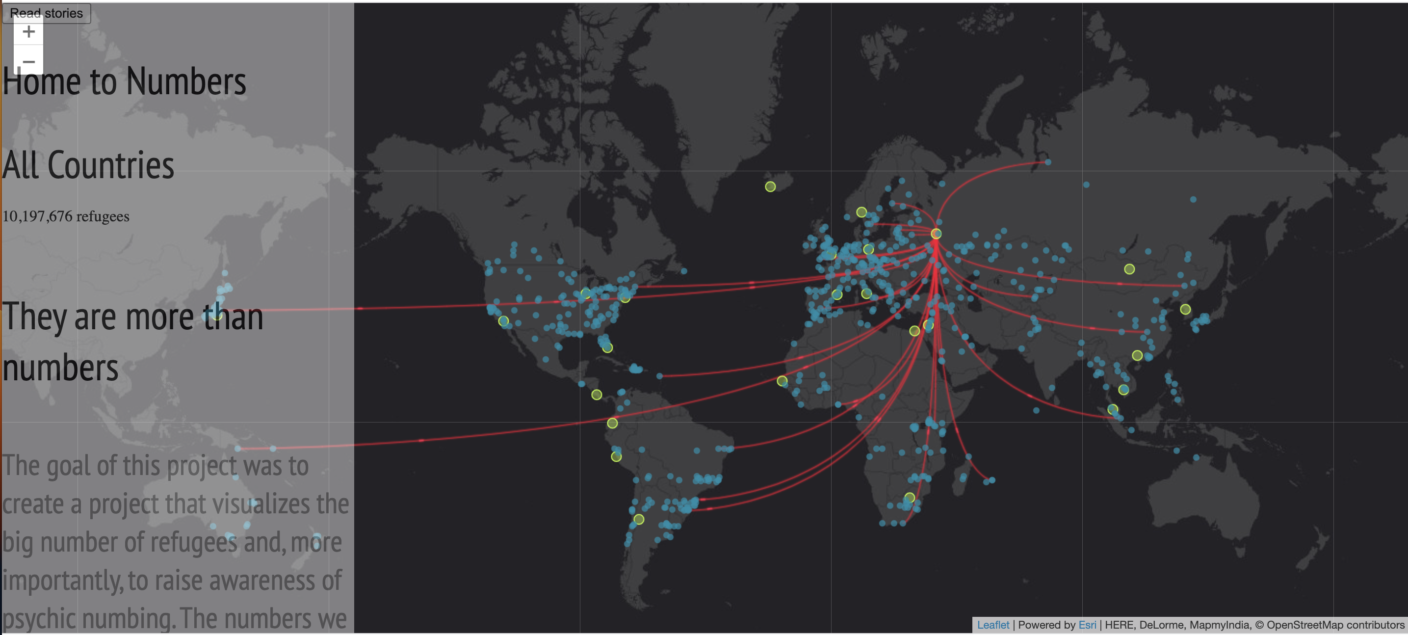
Final Product Overview
Github Repository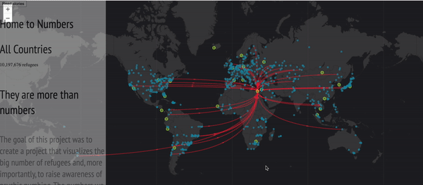
Mapping and Data Visualization
How and where can I vizualise refugees data and why
Choosing a base map was an important decision and I ultimately decided on "DarkGray" by FleatLet due to its aesthetics and ability to be easily implemented on the web with responsive design. To animate the lines and show movement and connect the dots of the dataset, I used Tween.JS, along with the basic JQuery library. I also utilized some basic HTML and CSS to build the framework of the project. While I considered using React, I found that it was simpler to use HTML and CSS when working with multiple JavaScript libraries.
Leaflet is the leading open-source JavaScript library for mobile-friendly interactive maps. Weighing just about 42 KB of JS, it has all the mapping features most developers ever need.
Fetching Data
UNHCR offers custom-query data engine on all refugee data from the past 20 years
I customized the data sets through the UNHCR website, which was the only reliable source of data I could use. They offered a query called One-to-many, which provided information on countries and all the refugees that left from them and where they all went to by cities. To envision how the project would look, I used Figma to create wireframes and mockups. We used directed storytelling to elicit their stories, emotions, thoughts, actions, and pain points.
After finding the requested data I chose a I was able to get
a query that is calledOne-to-many. So it is the countries and all the refugees that left from it, and where they all went to, by cities.
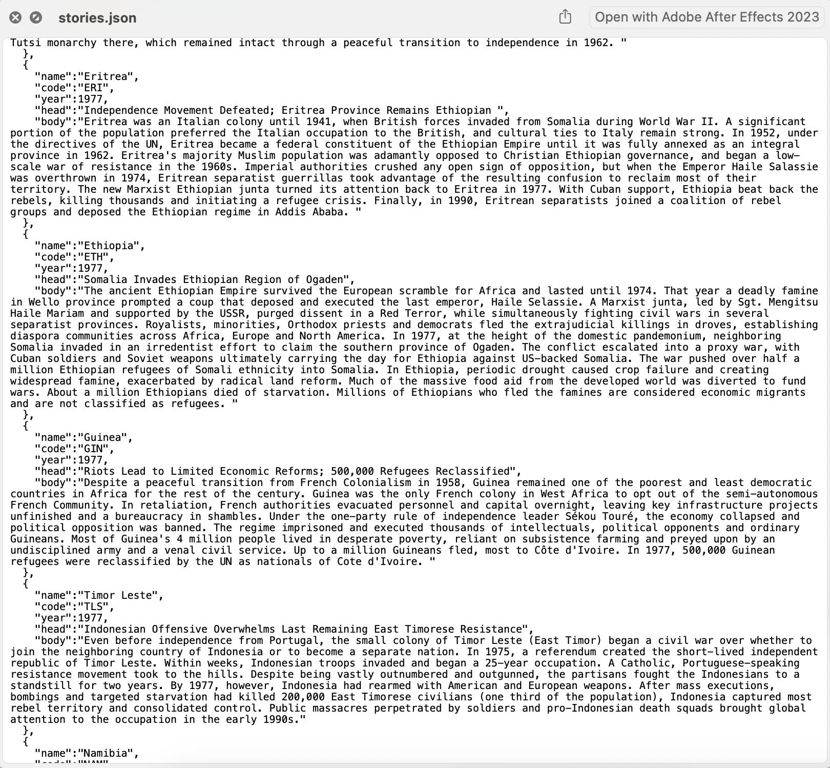
Example of a stories JSON query
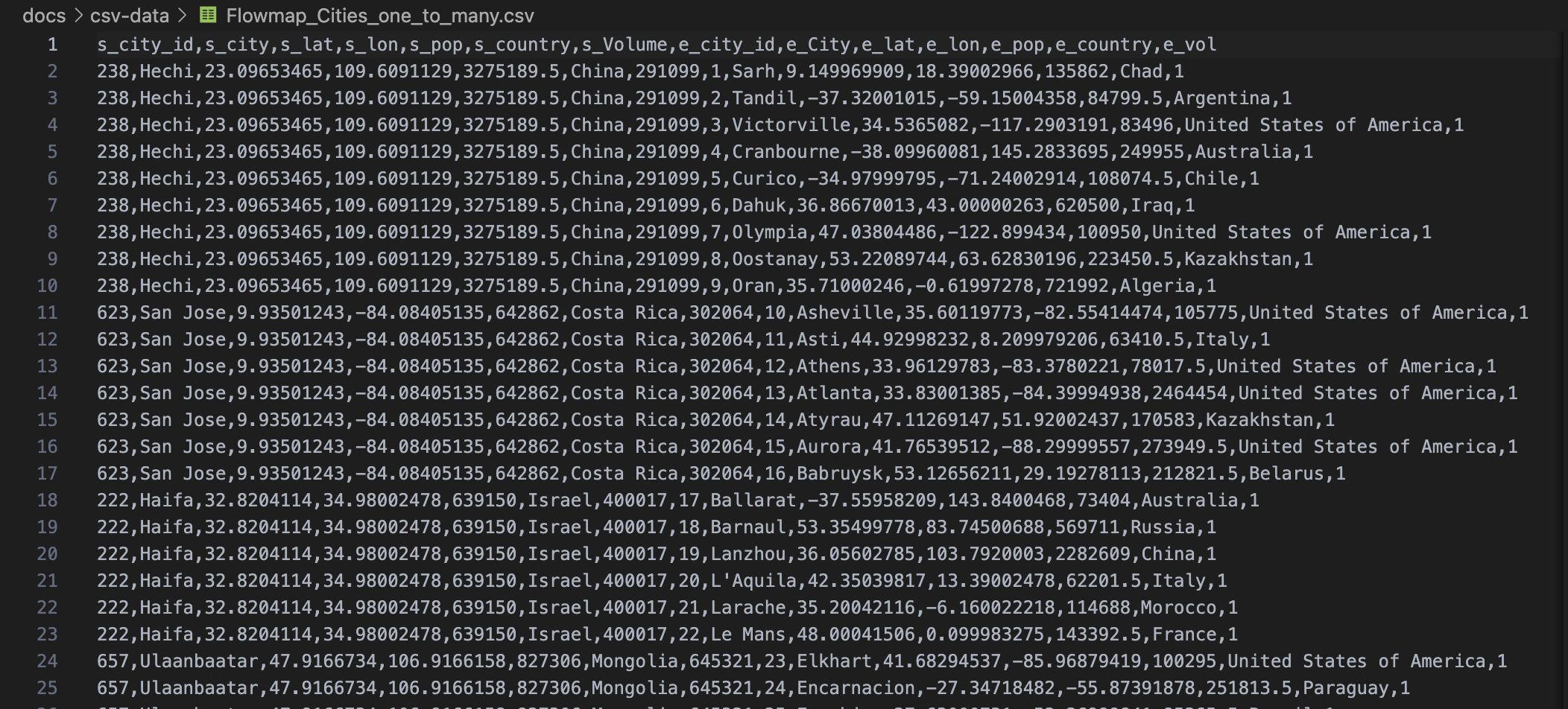
Example of a One-to-many JSON query
Though, it is important to notice that so many refugees are undocumented and paperless and that the UNHCR only offers data of refugges that were documented
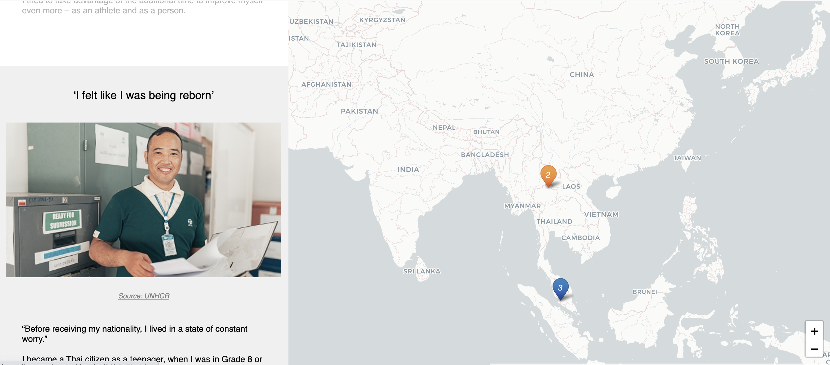
Interactive Storytelling
Giving Refugees a platfrom
I wanted refugees to be able to post their stories in the most accessible way possible. To achieve this, I created a Google spreadsheet where they could write their stories and prepared HTML ids so they could upload images, videos, and links, along with the longitude and latitude of their host country.
When users wrote on the Google spreadsheet, it updated automatically on the website using Google's API. I also used the UNHCR website as a reliable source of data and stories of refugees. How can we transform course registration into a learning experience?
THE PREFERRED FUTURE
In the preferred future with Home to Numbers, Features implemented included the ability to visualize numbers of a big data set to convey the message and make it clickable with interactive elements. Additionally, the reading of the stories map view was enabled so that when users scrolled, the map moved to the story they were reading. However, there were some features that I wanted to implement but could not either due to time constraints or technical limitations. These included linking the stories dataset JSON file to the main refugee visualization, having a label of what the numbers were when hovering over the dot/circle, and implementing an HTML grabber from the UNHCR website to update the stories automatically.
REFLECTIONS
Not being able to have the hover-over number details turned out to be a blessing in disguise. The broad abstract of the map serves the message of the concept well. The more I worked on this project and the more I read about the problem, the more confident I became in my choice of topic. The data was massive, and the issue was significant, yet few people were aware of it. This project served a greater purpose, and I am grateful to have been a part of it. I discovered multiple software and technologies during the learning process that I am definitely going to use in the future, including Plotly for building and deploying data in apps built with Python, Tailwind, and CSS framework for building websites without leaving HTML, and many map APIs.